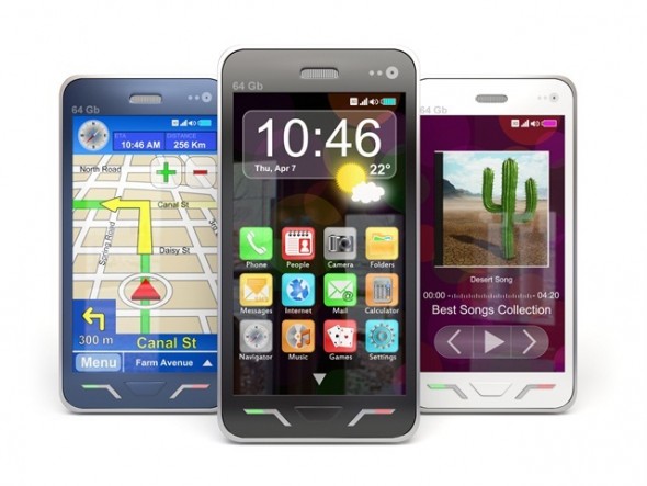

Image Credit: Fotolia
What is the difference?
A website that is mobile friendly has little to no flash and can be viewed by a smartphone, however, the viewer has to move the screen around to see the page. The page is too large to be viewed by the phone. The viewer has to zoom in and out on their screen to read the content (which is a pain). Basically, she/he sees the website in the same manner as if on a desktop.
A mobile optimized website is made specifically to be viewed on a smartphone in a different way than the desktop version. It is easier to navigate because it is made for a smaller screen, the pictures are smaller or nonexistent (which helps to decrease load time) and with one touch or click, the viewer is able to make a phone call, send an email, and much more. These sites are responsive to the device they are being viewed on and the look is adjusted based on that device.
A website that is un-mobile and unfriendly is a site that is usually built with flash so when viewed on a mobile device your website visitors viewing your site on an iPhone or iPad get a blank white or black screen. These sites do not have a mobile version to them so they can be slow to load and are the same size as they are on a desktop. Can you imagine looking at a desktop site on a small 3″ -4″ screen? All of the functions may not be functional on these sites; for example, slideshows and links. These sites get the award for “The Most Un-Friendly Customer Sites” and the “Let Me Hurry Up and Go to Another Website That Isn’t Such a Pain Award.”
If you were a visitor on your website, which site would you prefer? The website that you have to move around, and continue to zoom in and zoom out or the website that thought about you and your experience and took the time to create a website that would allow you to have a great experience by making it easy for you to navigate? Having a mobile website is a way to let your prospects know you kept them in mind. If you are making it difficult for your website visitors to view your site, there is a strong chance they will close their browser and go to another site.
Which of these mobile website categories does your website fall into?


