
Image Credit: Christina Hamlett
If you’re going to go the route of DIY advertising rather than paying a professional to do it for you, make sure it doesn’t become as wasteful an exercise as throwing spaghetti against the wall and then wondering why it doesn’t stick.
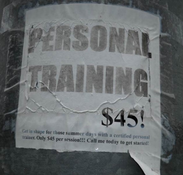
Amateur efforts in DIY advertising include everything from an unfocused or cluttered design to doofy verbiage that elicits unintended snickers. An entrepreneurial dog lover in our neighborhood, for instance, recently posted dozens of homemade goldenrod flyers with the words, “Pet-walking services for your dogs that are honest and responsible.” (I’m assuming this excludes dogs that aren’t honest and responsible.) If you’re only 12, these mistakes are amusing; if you’re over 35, you definitely need some outside input.
Whether you run a business from your home or have a brick and mortar store, promotional elements such as print ads, newsletters, blogs, streaming videos and websites are often the first impression that customers have about who you are, what you have to offer and what type of call-to-action is expected on their part.
The media pays close attention to these materials as well, not only because the background information they supply can be useful to the development of a story but because they also reflect the personality and the level of resources – both financial and creative – behind the message. Plain and simple, throwing together a DIY advertising campaign on the cheap will end up costing you way more than you paid for it.
While some aspects of DIY advertising offer you the latitude to be wildly imaginative, there are others such as guest blogs, newspapers and magazines that require you to stay within whatever parameters have been set by the host entity.
One of the more hair-tearing experiences I had with the latter was when I volunteered to create a two-page advertising spread for a group of authors that had new books coming out. Because print magazine ads are typically cost-prohibitive for most writers to afford on their own, my proposal of a co-op arrangement was enthusiastically received. For only $40 per person, the participants would each have a generously sized black-and-white display ad featuring their book cover, a 25-word ‘blurb’ and their website URL.
Since I was utilizing a layout template provided by the magazine, the instructions were meant to accommodate universally-sized cover images and fonts. Likewise, the placement of the images would be a balance of light and dark covers as well as title themes. Two books related to the Civil War, for instance, would not appear right next to each other but, rather, on opposing pages so as not to cancel each other out. Some of the covers were in a landscape rather than traditional portrait configuration which also factored into the final placement. (As a point of interest, instructions such as the ones I gave are not unlike the kind you’ll receive if you purchase ad space in your weekly newspaper and decide to provide all of your own content for it.)
As straightforward as I kept things, it soon became apparent that – to paraphrase Captain Barbossa from Pirates of the Caribbean – the authors interpreted my request ‘more like guidelines than actual rules.’ Over the next few weeks, I was peppered with the following inane questions:
- “My cover looks boring in black and white. Can you do mine in color instead?”
- “My bio is over 100 words. Does that count as part of the 25?”
- “Twenty-five words isn’t enough. Can’t you use a smaller font?”
- “Is so-and-so buying an ad? I don’t want my ad next to hers.”
- “I have a new headshot I really like. Can I have my picture in the ad instead of my book cover?”
- “My blurb is 35 words. Can you cut me some slack on this?”
- “My book is really important. Can you make my ad bigger?”
- “Do I get a refund of my $40 if I don’t sell any books as a result?”
And the best one:
- “Why do we have to pay anything for this? Doesn’t the magazine have extra pages they have to fill up anyway?”


